All Time Favorite

Recent Posts

Thursday, March 5, 2015

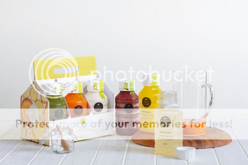
Healthy Lifestyle, Detolixir, and Its Identity


Have I told you that lately I feel like I need to maintain a healthy lifestyle, not just because I'm getting fat and fatter, well, yes that the main reason. After a deep research, in google of course, I found out that detoxing is really good for our body, not just good for weight loss but it also boosting immunity, balance skin condition (underlined, it's super important right?), and improved nail and hair strength.

Share:

Wednesday, February 25, 2015

Asa: Thought and Hope


A clothing line project for moms and kids, emphasis the S word as an ampersand to visualize the capital A word as a symbol of moms and the lowercase as a kid, simply it means Mom & Kid. The word Asa itself  means hope, its a result of deep thinking/thought of the designer.

Share:

Tuesday, August 19, 2014

Monday, August 11, 2014

Du Noir Naît La Lumière

Du noir naît la lumière”,  translated “Through black… light revealed”. Black has this immense power of revealing light in a space. This mix is a proof. How about you, do you use a lot of black in your today's outfit?

Were styling for Jawa Pos Koran Lebaran Edition last month, in black and white. Find out more the tips how to wear black and white there!
Share:

Monday, July 14, 2014

It's Not My Work, It's My Passion


"GAMBAR bukanlah sekadar kumpulan coretan tangan. Gambar terasa kurang hidup jika tak mengandung filosofi atau makna khusus. Sebab, sebuah gambar diciptakan untuk menarik perhatian orang lain. Dengan begitu, punya nilai jual lebih tinggi dan memberikan keuntungan kepada pemiliknya. Itulah yang selalu dibangkitkan Anata Kusuma sebagai graphic designer."
View more on Jawa Pos.

Beyond grateful, featured on Jawa Pos this past week. The photographs take place at Peco Peco Sushi Outlet Tunjungan Plaza, where I designed the wall artwork in a fun cloudless atmosphere and highlight the sushi characters. Don't forget to stop by and take selfies in front of the wall! *wink*

 Tunjungan Plaza III Lt. 5 No. 74-75
Surabaya, Jawa Timur

Share:

Sunday, June 29, 2014

Mee Djin Couture


Re-designing corporate identity is always a challenging task. Decided to keep using the old logo because it's not only chic but presenting the company very well, and choose to change the color corporate logo and overall appearance of the company to show the elegant side and make it more modern.

Mee Djin Couture is one of the reputable bridal in Surabaya for its service and design, offers a wide range of wedding and party dresses collection. And began expanding into the lifestyle. 

Quoted from their website: "Mee Djin is now one step closer to your life. We can customize your corporate uniform that looks professional yet still stand at the front of current fashion. Mee Djin also comes to assist your interior design project."


Jalan Arief Rachman Hakim
Perumahan Regency 21 I-10
Surabaya, Jawa Timur
(031) 5911929 / (031) 5982901

Share:

Tuesday, June 24, 2014

If it looks right, it is right.

"The essence of interior design will always be about people and how they live. It is about the realities of what makes for an attractive, civilized, meaningful environment, not about fashion or what's in or what's out. This is not an easy job." - Albert Hadley


A logo design and business card design for Marissa Suwandi Interior Design, interior designer and consultant. Using the initials of the name and make it as a symbol in structural shape to evoke the feeling of kilter, balance, and elegance. The overall design convey the style of the designer's artwork.

...and one my last quote that I love from Dorothy Draper, "I believe in doing the thing you feel is right. If it looks right, it is right."
Share:

Tuesday, June 17, 2014

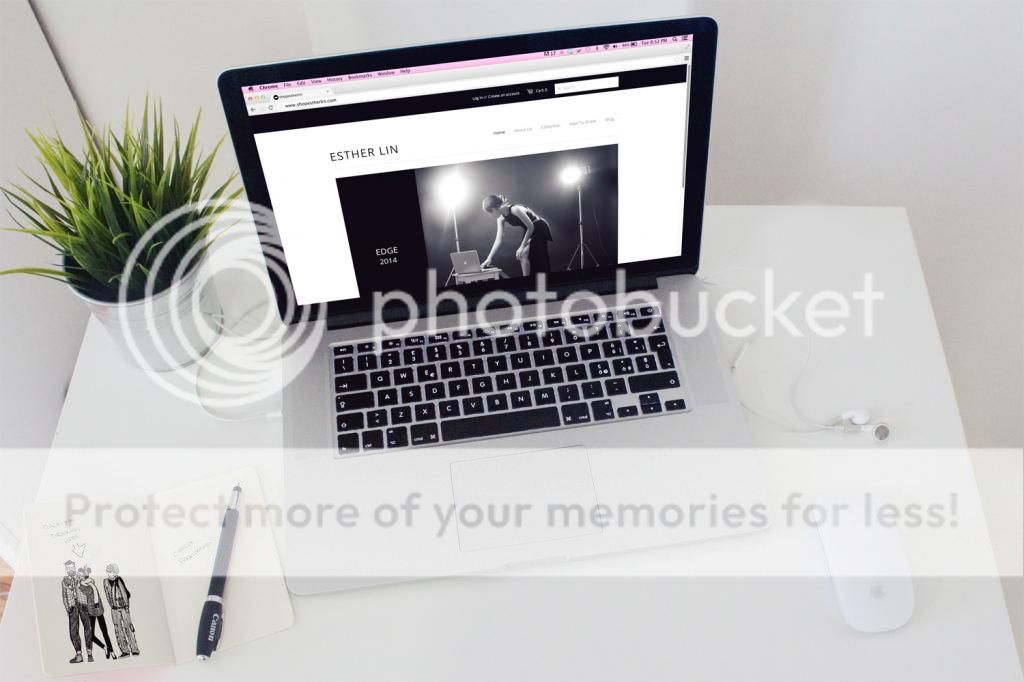
shopestherlin!


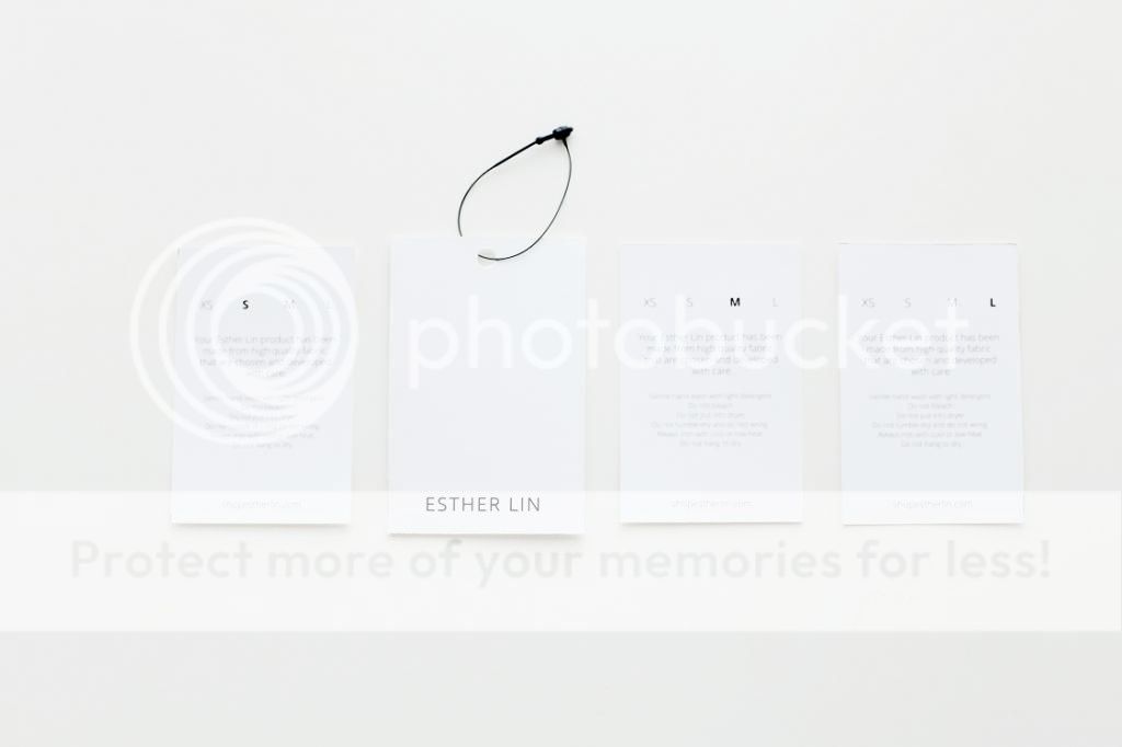
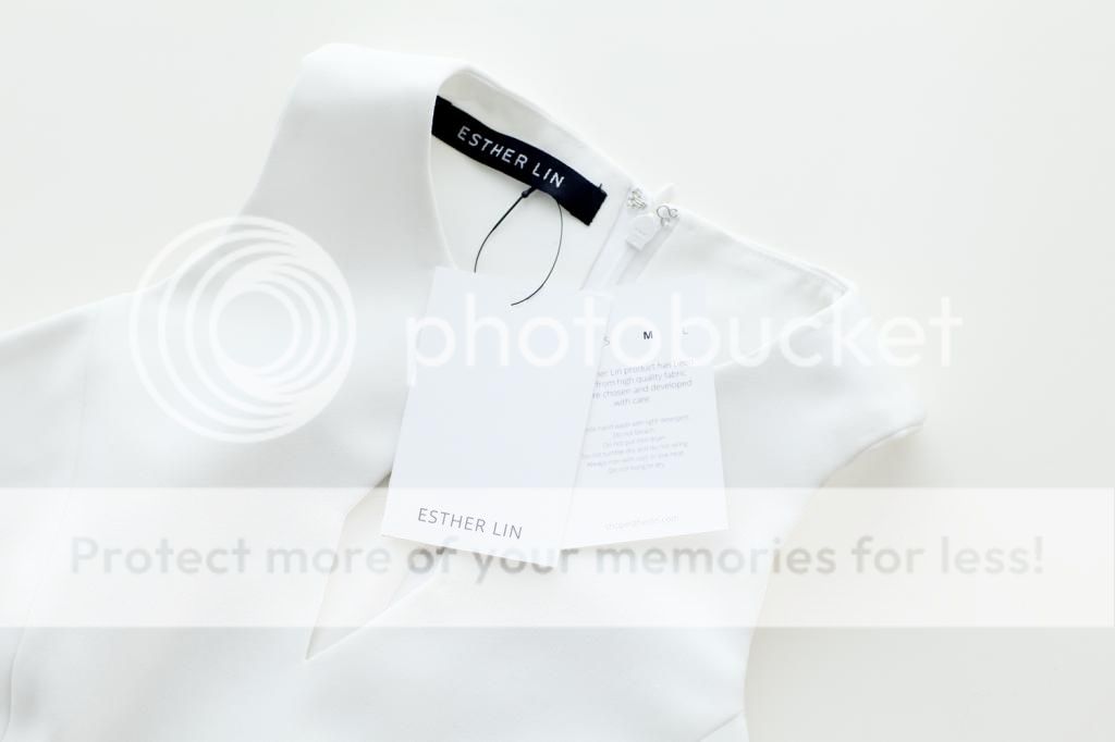
"Established in 2014, Esther Lin is a ready to wear Indonesia-based label. Providing beautiful everyday classics accented with modern clean cut, looks that embody youthful elegance. We embraces a new perspective of elegance in minimalism. Our collection are designed and produced in high quality material."

Corporate identity design for Esther Lin Ready To Wear's Label. Creating a logo with sharp edge and in minimalism represent the label itself. Check out the website here. Instagram here.
Share:

Thursday, January 10, 2013

Run Baby Run


A logo for a fashion label founded by a super talented woman, Serafi Anellies Unani, Indonesian runner. The running woman shilouette in the logo is designed to evoke the feelings of adjectives represent the founder who is sporty, playful. Even though we know about her passion for running, both of us don't know of her love for fashion. So, take a peek at her collections here.
Share:

Wednesday, January 2, 2013

Flashback: YLPT Project

2012 is already passed, you can't change the past but the past do affected our lives right now. You can't go back and manipulate things to the way you wanted them to happen because life would be meaningless, but you can change what's in the future. It is never late for a brand new fresh start, have a goal in live!

Back in 2011, two years ago, when I was graduated from university and I didn't know why did I majoring in Visual Design Communication. I didn't have purpose in life and I was living my life just like water flowing from nowhere to wherever it takes. At some point I thought what a boring life that I have been trough. Then I looked out and tried to living life to the fullest.

I was totally stressed out about my final assignment that time, and I prayed to God about it. Well I did not expect that my final work would been displayed in Final Project Exhibition that time.


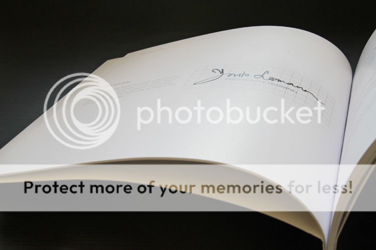
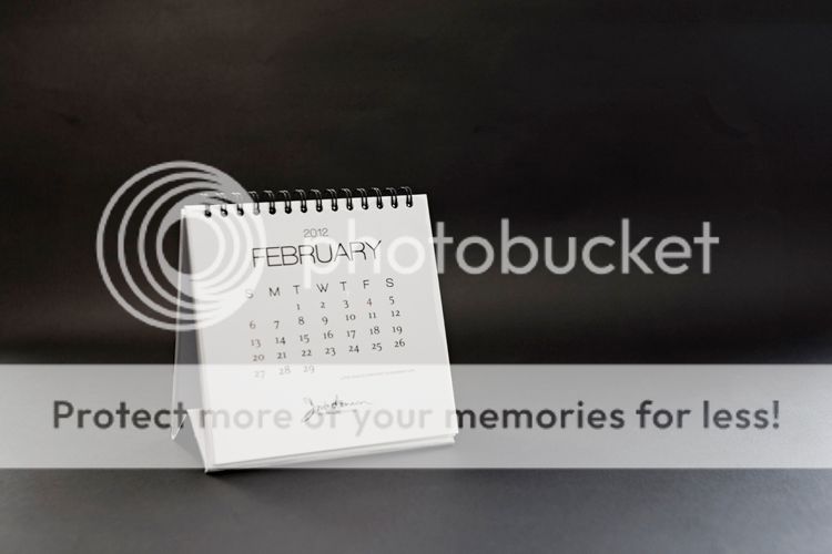
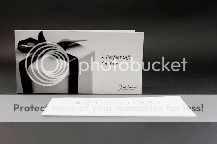
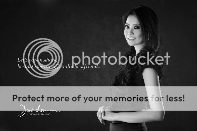
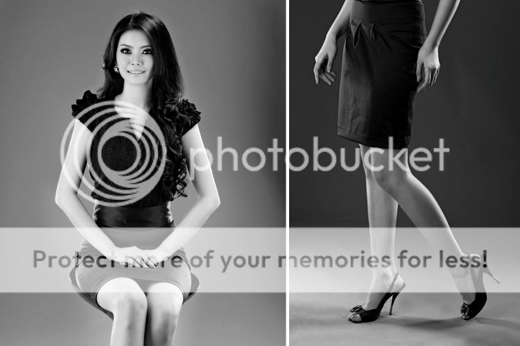
I have created corporate identity for my final project. Basically, it was a corporate identity for Yovita Lesmana Personality Training, a company that provide tools to be successful in business and self development training, and here's some of my works:


Well, you can take a peek at her website here, though I didn't design the website, or her fabulous twitter feed :p

"If life throws you lemons, make lemonade." Joan Collins
Share:

Sunday, December 23, 2012

Once Upon A Time: Esther Lin Project

The prospects of attending a special event or occasion never fail to excite us, girls. These are the nights worth dreaming for- of careful planning and envisioning the perfect ensemble, head to toe. These are our chances to star in our fairy tales. On these nights, we dress to kill. Paint this picture in your head, one we are all too familiar with: as you step out of the horse carriage, your dress clings rightfully, its train trailing behind so obediently, making its way through the entranced crowd.


Setting out with that same dream tucked in her heart, Esther Lin proclaims her passion to make our fairy tale nights come true. Now available for you...


One of my latest projects, Esther Lin, a branding of young talented Indonesian fashion designer. Esther Lin is commited to providing the right style with an elegant taste of couture collection. The logo are designed to give an endless look with a bit of sweet touch yet simple and elegant. The script font is specially designed to represent the creative stroke of the designer. A monochrome color used for the logo is pastel grey to give the timeless and classic atmospheric of quality.
Share:

Sunday, December 2, 2012

Raffiné: Andalucia by Astrid Satwika

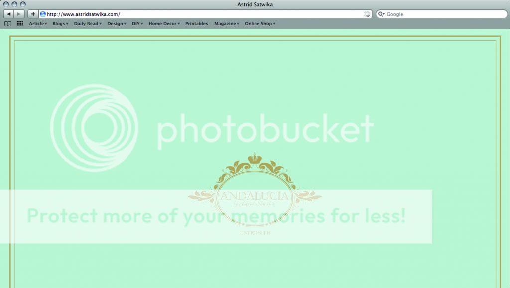
Creating a logo for Andalucia by Astrid Satwika and its application in website design. Andalucia is a fashion brand by Astrid Satwika, a manifestation of her passion in fashion. The overall logo represent Andalucia as a brand that brings simple and wearable dress that can be worn everyday, giving a touch of feminine, yet chic!


Share:

Tuesday, November 27, 2012

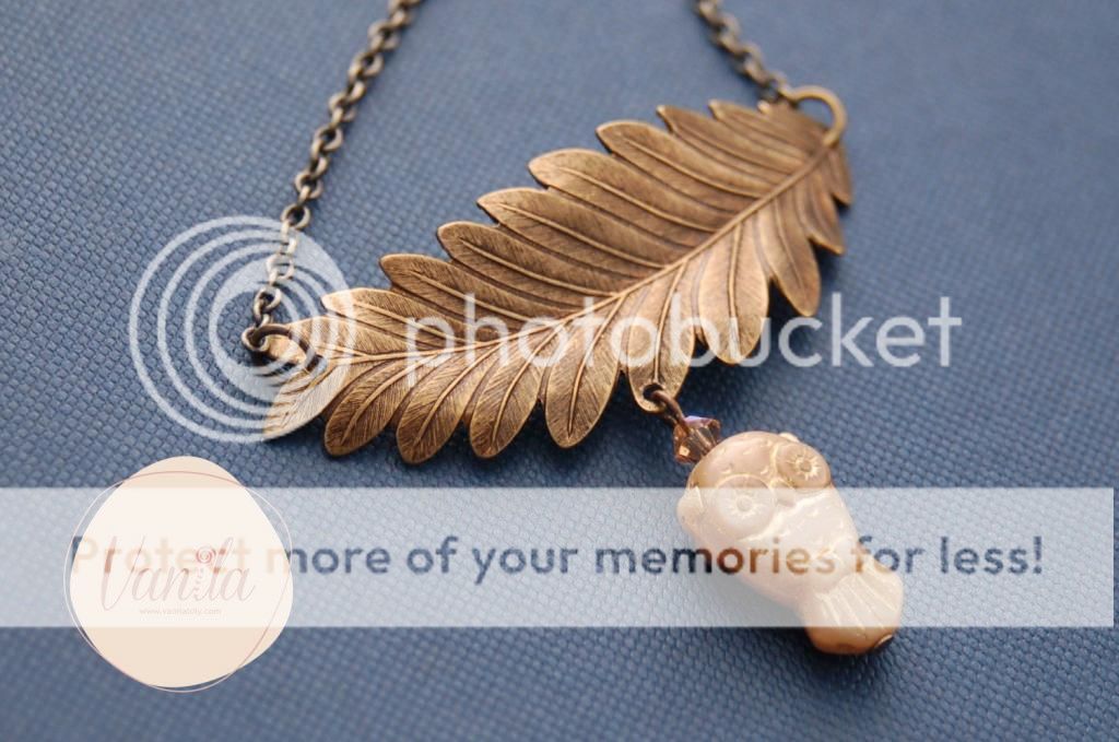
Sweet As Lollipop: Vanila


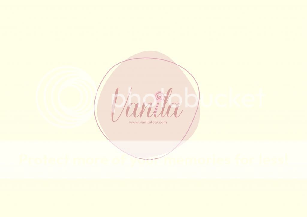
Creating a logo that represent the image of Vanila, a member of Seven Icons, one of Indonesia's girlbands. She's about to launch her first collection of jewelry and accessories, named as hers Vanila
The lollipop image represent Vanila, aka Miss Lollipop, while the color to create a sweet and lovely vibes. To reflect the brand’s free spirit, the circle and border are placed randomly around the main logo.
Share:
© anatakwok | All rights reserved.
Blogger Template Developed by pipdig